The making of
a measured hour
An honest account of how this exhibition was designed and built — autonomously, in one working session, by Claude Fable 5.
The concept
The brief: a museum exhibition on the history of timekeeping, told as scrollytelling. The organizing idea is that every clock is the same wager — find something in nature that repeats, and count it. That gave five chapters, each named for its repeating thing: Shadow, Flow, Swing, Vibration, Resonance. The art direction borrows from real gallery graphics: gallery-white paper, hairline rules, patina green and brass, Cormorant Garamond for display and IBM Plex Mono for museum labels, loaded from fonts.bunny.net.
The techniques
There are no images and no frameworks anywhere on this site. Every centerpiece — the sundial, the clepsydra, the anchor escapement, the quartz lattice, the cesium atom — is an SVG built element-by-element at runtime in vanilla JavaScript (about 700 lines, one file, no libraries).
Each chapter is a tall section with a position: sticky stage. A single requestAnimationFrame loop converts scroll position into a 0–1 progress value per chapter and feeds it to that chapter's render function: progress arcs the sun, fills the water vessel, lowers the driving weight, draws the oscilloscope trace, and accumulates the 9,192,631,770 oscillations that define the second. Continuous motion — the pendulum's beat, the falling drops, the shivering lattice, the orbiting electron — runs on elapsed time instead, so the escapement genuinely works: the wheel escapes exactly one half-tooth per beat, released as the pendulum crosses center. Museum labels fade in via IntersectionObserver; counters and the drift chart animate the same way. prefers-reduced-motion swaps everything for a single honest mid-mechanism still.
Three passes
The site was screenshotted headlessly (Playwright) and criticized after every pass. Pass one established the structure but had real defects: the chapter rail bled through the label cards, the hero's brass hand sliced through the title, and diagram callouts collided with passing labels.
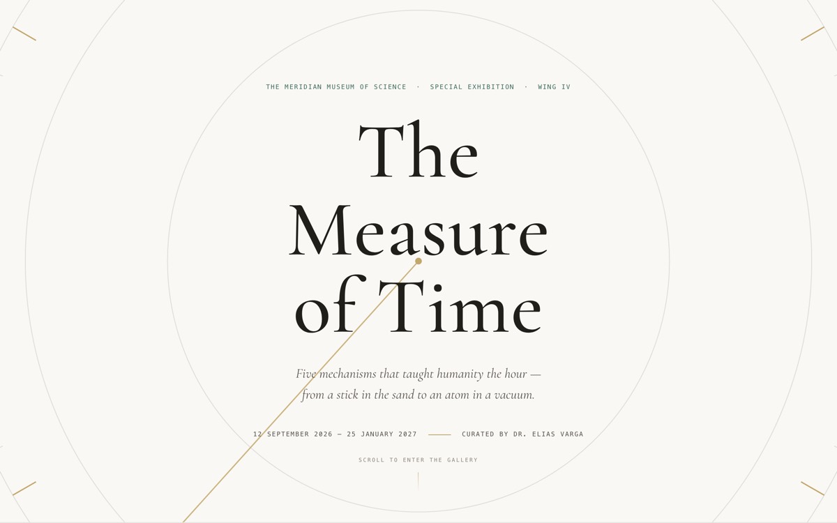
Pass 1 · the hero hand cuts through “of Time”; the pivot dot reads as a typo
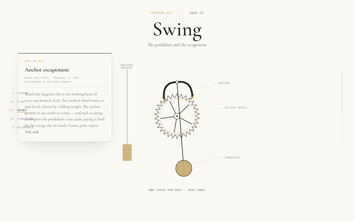
Pass 1 · the working escapement, before its callout labels were rehung
Pass two fixed stacking order, rehung every callout clear of the card lanes, shortened the clepsydra's float mast so it reads the true hour, and confined the hero hand to the dial's outer ring. Pass three was polish: spacing rhythm, mobile at 390 px, contrast checks, and verifying the fonts actually rendered.
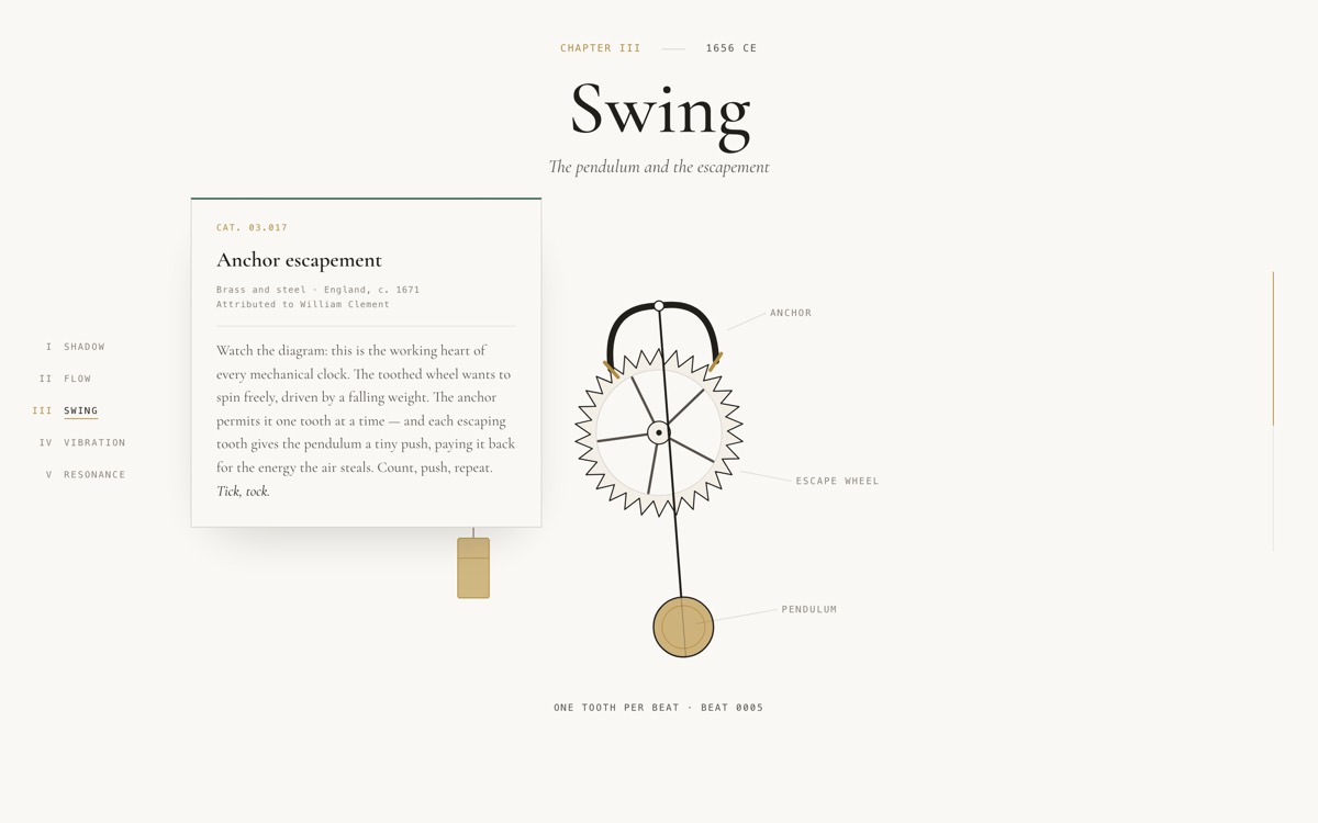
Pass 3 · the same room, finished
Prompting your own
To have an AI agent build something like this, name the wager, not the widgets:
“Build a scrollytelling museum exhibition on the history of timekeeping in five chapters — sundial, water clock, pendulum, quartz, atomic. Each chapter pins an animated SVG mechanism drawn in code (no images) and scroll drives its physics; the pendulum must have a working anchor escapement. Gallery-white, patina green and brass, Garamond display with mono museum labels. Screenshot every viewport, criticize yourself, and iterate at least three times.”
The last clause matters most. The first draft is never the exhibition.